Photo by dlxmedia.hu via Pexels.
A podcast launch budget almost always goes entirely to the audio chain. Then the show launches into a directory, competing as a thumbnail against a thousand other thumbnails, and there's nothing on hand for the one moment that isn't audio at all.
A new podcast needs four visual assets before episode one: cover art that reads at thumbnail size, a host portrait that works cropped square and as a standalone press photo, a few setup shots proving the show is real, and a clip template (a recurring frame and caption style) for short-form video.
Table of Contents
- Why the Audio Budget Quietly Becomes the Whole Budget
- What a Podcast Directory Actually Rewards in Cover Art
- The Host Portrait That Has to Work Twice
- Recording-Setup Shots That Prove the Show Is Real
- The Clip Template That Makes Episode Forty Recognizable
- Why Filming the Session Is Cheap Before and Expensive After
- What to Have Ready Before the First Recording
- The Honest Scope Note: A Launch Doesn't Need a Full Brand System
Why the Audio Budget Quietly Becomes the Whole Budget
A podcast launch budget almost always goes entirely to the audio chain, because a microphone, an interface, and editing time are the concrete, researchable costs. The visual assets a show also needs (cover art, a host portrait, setup photos, a clip template) don't get a line item because nobody's shopping for them yet.
That's an understandable order of operations, not a mistake exactly. Sound is the product. A podcast with clean audio and no visual identity is still a podcast; a podcast with great visuals and muddy audio isn't listenable at all, so protecting the audio budget first is sound thinking.
The problem shows up later, at launch, when the show has to exist somewhere other than the feed itself (a directory listing, a share card, a guest's announcement post) and none of those places play audio. They show a static image, competing with every other show's static image in the same crowded row. A show can sound excellent and still lose the discovery moment on a visual it never planned for.
What a Podcast Directory Actually Rewards in Cover Art
A podcast directory renders cover art at roughly the size of a fingernail, next to a thousand other shows doing the same thing, so the art has to read as a shape and a value contrast before anyone's close enough to see detail. Fine text and busy backgrounds disappear at that size.
This is a different design problem than a poster or a website banner, where a viewer is a few feet away with time to take in detail. A podcast cover has to work at three sizes at once (a large master file for the app store listing, a thumbnail in a scrolling directory, and a tiny icon next to a play button) and the version that has to hold up is the smallest one, not the largest.
In practice, that means designing at thumbnail size first and scaling up, not the other way around. A cover that looks great as a large file and unreadable as a thumbnail has been designed backward, judged at the size nobody will actually see it at, then shipped anyway.
The Host Portrait That Has to Work Twice
A podcast host portrait has to do two unrelated jobs at once: crop cleanly into a square for the show's own directory profile, and work standing alone as the press photo a guest's audience sees when that guest announces the episode. Most portrait sessions get shot for one context and awkwardly stretched to cover the other.
The show's own square crop is forgiving. It sits next to the cover art and the show's own branding, so a tighter, more stylized shot works fine there. The press-photo use case is less forgiving, because it shows up cold, on someone else's feed, often with no other context explaining who's in the frame. That version needs to read clearly on its own: real eye contact, a clean background, nothing that depends on the show's own visual identity to make sense.
Shooting one portrait with both crops in mind (enough headroom for a square, enough context for a wider standalone frame) covers both jobs from a single session, instead of needing a second shoot once the first guest asks for a photo to run.
Recording-Setup Shots That Prove the Show Is Real
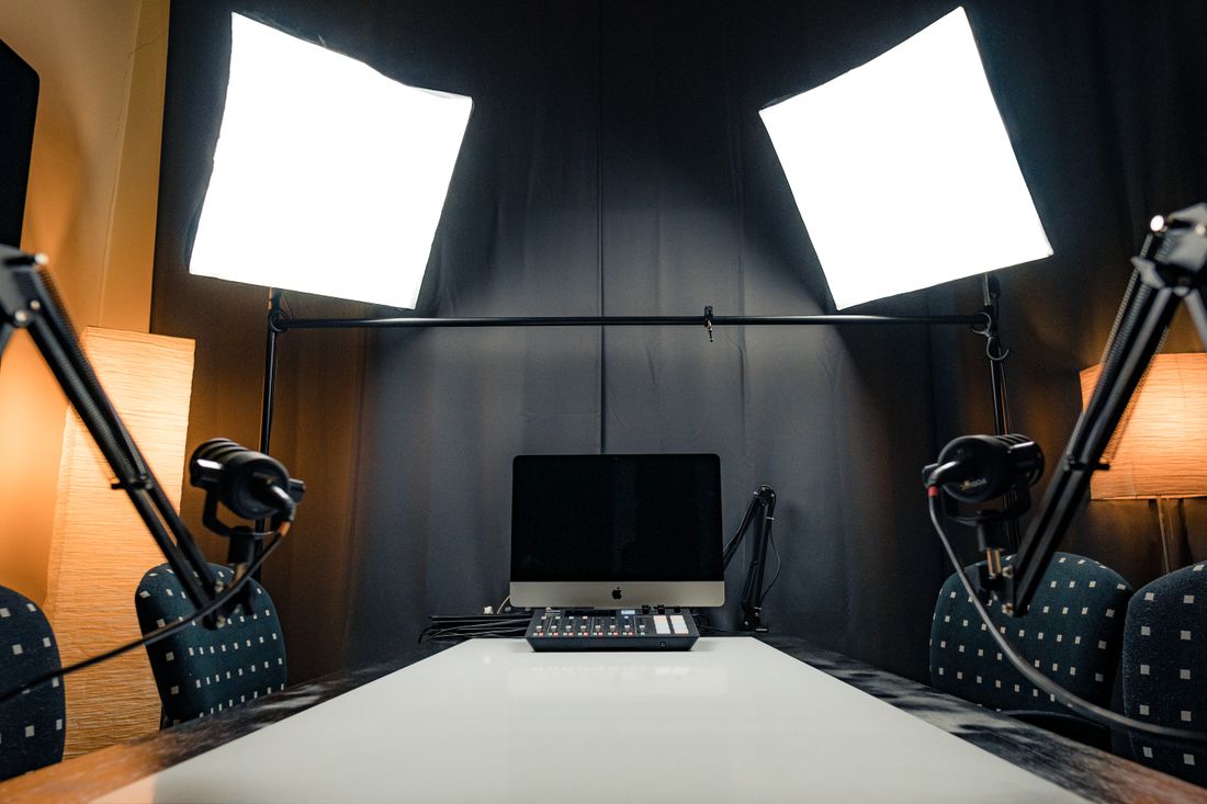
Before a new podcast has any episodes to point to, recording-setup photos are the only proof the show exists (mics on stands, the room, hands adjusting a fader, the host mid-conversation). They do the job a behind-the-scenes photo does for any launch: showing real infrastructure and real activity before there's a finished product to show instead.
A new show's landing page, sponsor pitch, or first social posts have nothing to display yet except a promise. A setup shot fills that gap honestly. It's not claiming to be an episode, it's showing that recording equipment exists in a real room and someone is actually using it. A stock photo of a generic podcast setup reads as exactly what it is; a photo of the actual mic on the actual desk reads as a real, specific show.
These shots also outlast the launch moment. A "we're recording" post before episode one, an about-the-show page, a sponsor one-pager six months in, all of them can reuse the same setup photography, because a recording room doesn't change nearly as often as the guest lineup does.
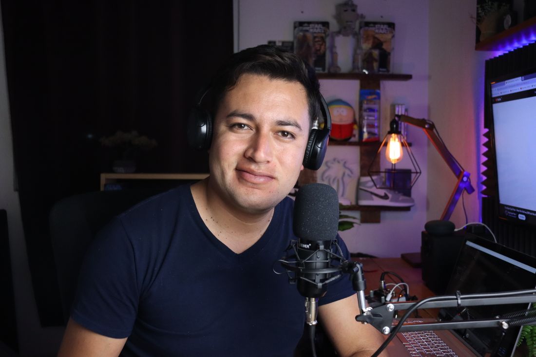
Photo by Benjamin Dominguez via Pexels.
The Clip Template That Makes Episode Forty Recognizable
A clip template is the recurring visual frame (caption style, color treatment, waveform look, lower-third placement) reused across every clip a show posts, so episode forty is recognizable as the same show as episode one before anyone reads the caption. Without one, every clip gets designed from scratch and never accumulates a visual signature.
This matters more than any individual clip looking good, because a scrolling feed doesn't give a new clip much time to explain what it is. A consistent frame does part of that explaining before a single word of the caption gets read. A familiar color bar or caption style tells a repeat viewer "this is that show" faster than context alone ever could.
Building the template is a one-time design decision, not an ongoing production cost: pick the caption font, the color treatment, whether the audiogram is a waveform or a static frame, and where the show's mark sits in it. Once that's set, every future clip drops into the same shell instead of getting reinvented episode by episode.
Why Filming the Session Is Cheap Before and Expensive After
Filming the recording session for setup photos, clip b-roll, or the host portrait costs almost nothing extra when it's planned before the room is set up. A camera on a tripod in the corner, decided in advance, adds minutes to a session that's already happening.
Decided after the fact, it means a second trip, re-lighting a space that was set up for audio only, and asking a host to re-perform a conversation that already happened once. This is a scheduling decision more than a budget one. The marginal cost of a second camera running quietly during a recording that's already booked is small (no separate crew call, no separate location fee, no separate day).
The cost of doing it later is a whole second production: booking the room again, getting the host back in front of a camera, and trying to recreate a setup that's since been rearranged for the next session. The practical fix is deciding what visual material a launch needs before the first recording gets scheduled, not after a few episodes are already in the feed.
What to Have Ready Before the First Recording
Before the first episode gets recorded, a new show benefits from having its cover art finalized, the host portrait shot, and a rough clip template picked, in that order, because the cover art's color and type choices tend to set the visual language the portrait and clip template borrow from.
Doing it in reverse means redesigning the clip template once the cover art is locked. Cover art comes first because it's the one asset a show needs on day one, before a single episode is recorded. It's required just to set up a feed in most directories. The host portrait can follow closely behind, ideally scheduled for the same day as an early recording session so it isn't a separate shoot.
The clip template can be looser at launch and refined once a few real episodes exist to test it against. None of this needs to be finished months in advance. It needs to be decided before the first recording, so the room, the host, and the camera are all in the same place at the same time instead of three separate errands.
The Honest Scope Note: A Launch Doesn't Need a Full Brand System
A show with no audience yet doesn't need a full brand system (a style guide, multiple portrait looks, a library of graphic templates). It needs a thumbnail that reads at directory size and one portrait that works everywhere it gets used, cropped square or standing alone. Everything past that is worth building once there's an audience to justify it.
This is worth saying plainly because launch planning tends to expand to fill whatever budget and time exist, and a first-time host can talk themselves into a much bigger visual project than the show currently needs. A logo system, seasonal cover art variants, a full suite of clip templates for every platform. None of that changes whether episode one gets listened to.
The right-sized version of a podcast launch's visual kit is small on purpose: one cover that survives a fingernail-sized thumbnail, one portrait that covers both the show and the press use case, a few setup photos, and a simple clip template. That's enough to launch credibly. The rest can wait until there's a real reason (a sponsor, a growing audience, a second season) to build it out.
Frequently Asked Questions
What visual assets does a new podcast actually need before launch?
Four things: cover art that reads at a tiny directory thumbnail, a host portrait that works both as the show's own square profile image and as a press photo for guests to reuse, a few recording-setup photos proving the show is real, and a simple clip template for short-form video. That's the minimum, not a wish list. Most of it can come from one planned shoot.
What size does podcast cover art actually need to work at?
It needs to hold up at roughly fingernail size, since that's how it appears in a scrolling directory next to hundreds of other shows competing for the same glance. A cover designed and judged at full size often fails at that size. Fine text and busy backgrounds disappear entirely. Design at thumbnail size first, then scale up to the larger master file directories eventually require, not the other way around.
Do I need a separate photo for the show's cover versus press use?
Not necessarily separate photos, but the single portrait has to cover both jobs at once. The show's own square crop is forgiving, since it sits next to branding the show already controls. A guest's press use is less forgiving. It shows up alone, cold, with no other context attached. Shoot with both crops in mind: enough headroom for a clean square, enough context for a standalone frame.
What is a clip template and why does a new show need one?
A clip template is the recurring look (caption style, color treatment, audiogram or waveform, logo placement) reused across every short clip a show posts. It's what makes episode forty recognizable as the same show as episode one before a viewer even reads the caption. It's a one-time design decision made early, not a cost that repeats with every new clip a show puts out.
When should recording-setup photos actually get taken?
During the very first recording session, not after. Booking a second camera or a few minutes for stills before the mics are even on adds almost nothing to a session that's already happening. Coming back later means re-lighting a room set up only for audio and asking a host to re-perform a moment that's already passed, a second production instead of a few extra minutes.
Related Reading
Working on founder content or a launch and not sure what to shoot?
Tell us where the content needs to live (site, LinkedIn, press, or a launch page) and we'll come back with the scope and a fixed price before anything gets booked.
See Personal Branding & Launches