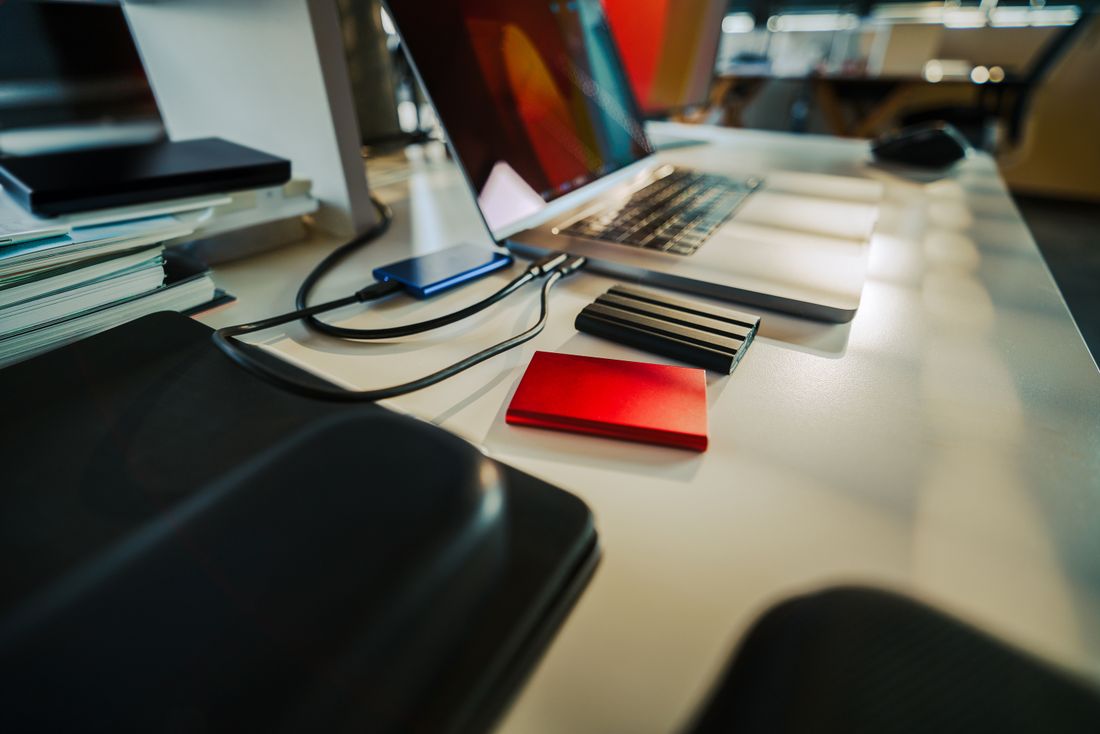
Photo by Jakub Zerdzicki via Pexels.
Nobody emails a founder to say the press kit photos didn't work. A reporter on deadline just doesn't use them, grabs a LinkedIn screenshot instead, or runs the story with no image at all. The failure is silent, which is exactly why it's easy to ship a press page that looks finished and isn't.
A press kit works when a journalist can find, open, and use a photo without emailing anyone first. That means a portrait in both horizontal and vertical crops, a neutral background, print and web file sizes, a caption and credit line already written, and clean file names, sitting in one findable place with usage rights spelled out.
Table of Contents
- Why a Press Page Fails Quietly Instead of Getting Complaints
- What to Actually Shoot: Portrait, Product or Space, and a Couple of Working Shots
- What to Leave Out of a Press Kit
- Print vs. Web: Why Every Photo Needs Two Files, Not One
- Horizontal and Vertical Crops of the Same Portrait
- Why the Background Has to Be Neutral, Not Branded
- A Caption, a Credit Line, and File Names That Survive a Download Folder
- A Usage-Rights Line and Where the Files Should Actually Live
Why a Press Page Fails Quietly Instead of Getting Complaints
A press page fails quietly because a reporter on deadline doesn't file a complaint about unusable photos. They just skip them. No email, no feedback, no chance to fix it before the story runs. The founder finds out only when the piece publishes with a LinkedIn headshot or a generic stock photo instead of anything they actually provided.
This is different from most content problems, which at least generate some signal. A broken contact form gets a frustrated email. A confusing pricing page gets a question before someone buys. A press kit with the wrong crop, the wrong resolution, or no caption gets nothing. The journalist has already moved to the next task, and the founder never learns which specific thing broke.
That's what makes this worth getting right up front rather than iterating after the fact. There's no failure signal to iterate on. The only feedback is whether your own photo shows up in the piece or someone else's does.
What to Actually Shoot: Portrait, Product or Space, and a Couple of Working Shots
A usable press kit needs three kinds of images: a portrait set of the founder, a shot of the product or physical space, and a couple of working shots showing the person or the work in context. That's the full list. A press page built from just one headshot is answering a narrower question than most stories actually ask.
The portrait carries the most weight because it's the one nearly every piece runs, whether it's a founder profile, a funding announcement, or a quote roundup. The product or space shot matters for anything that needs to show what the company actually makes or where it operates (a SaaS dashboard screenshot, a storefront, an office). The working shot (someone at a desk, in a meeting, mid-task) gives an editor an option that isn't a static portrait when the story calls for something with a little more life in it.
Three categories, a small number of finals in each, all shot on the same day so lighting and tone match.
What to Leave Out of a Press Kit
A press kit doesn't need behind-the-scenes candids, logo lockups in every color variation, or a full event gallery. Those belong on a marketing page, not in the folder a reporter opens under deadline pressure. Padding the kit with options doesn't make it more useful. It makes the one usable photo harder to find.
The instinct to include more comes from a reasonable place. More choices feels safer than fewer. In practice, a journalist scanning a folder of forty files for the one clean portrait is more likely to give up and use nothing than to dig through it. A tight set of well-labeled finals beats a large dump of raw options every time.
Logo files are a partial exception. A transparent PNG and a simple SVG earn a place because outlets sometimes need the mark on its own. Everything else in the just-in-case category is usually better left out, or moved to a separate internal folder that isn't part of what gets handed to press.
Print vs. Web: Why Every Photo Needs Two Files, Not One
A press kit photo needs a high-resolution file sized for print and a smaller, compressed file sized for web, because the two uses have opposite priorities. Print needs enough pixel detail to hold up large on a page, and web needs a light file that loads fast without slowing down someone else's site.
One file optimized for either use is usually wrong for the other. A file built for a fast-loading web article looks soft or pixelated when it's blown up for a print spread. A file built for print is often needlessly heavy for a web embed, which matters to an editor whose CMS has its own size limits or whose site speed is already a concern. Neither problem is dramatic on its own, but it's exactly the kind of friction that pushes a journalist toward a photo that's already sized right, from anywhere else.
Two files per image, clearly labeled by use, removes the guesswork about which one to grab.
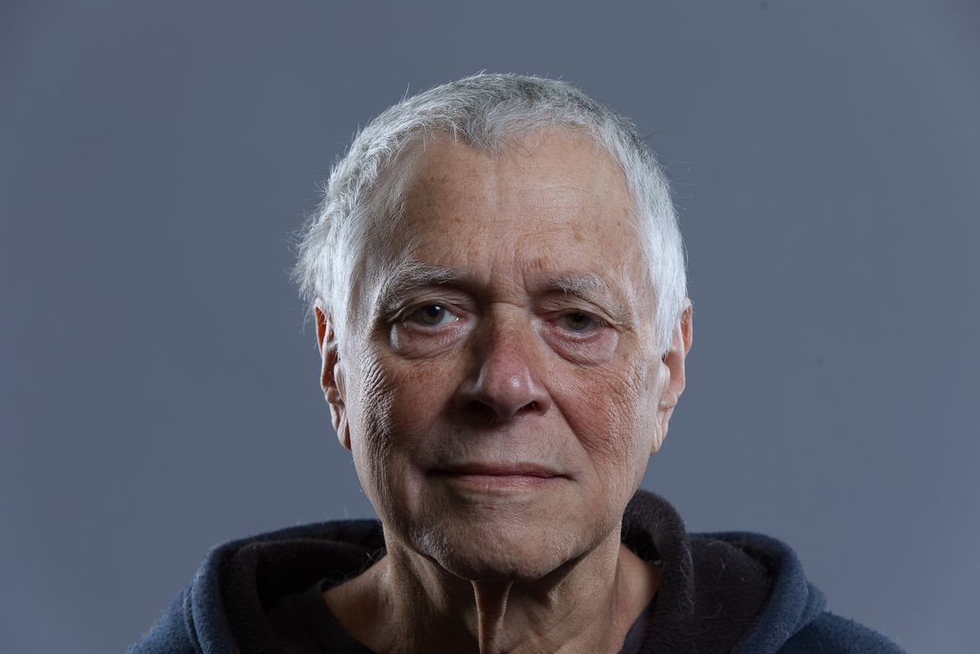
Photo by Daniel Hoffman Jackson via Pexels.
Horizontal and Vertical Crops of the Same Portrait
The same portrait needs both a horizontal and a vertical crop because editorial layouts aren't uniform. A wide header image needs a horizontal frame, and a sidebar, a mobile card, or a print column needs a vertical one. Shipping only one orientation means half the layouts a photo might land in simply can't use it as-is.
This isn't about shooting two different photos. It's about composing the original portrait with enough clean space around the subject (headroom above, room on both shoulders) so it can be cropped either way without cutting off a shoulder or crowding the face against the frame edge. A tight, centered crop with no breathing room only works in the layout it was cropped for.
An editor with five minutes before deadline won't open the file and recrop it themselves, and many CMS templates crop automatically to a fixed ratio the moment an image is dropped in, cutting off whatever doesn't fit. If the horizontal version doesn't match their layout and no vertical option sits next to it, they move on to a photo that already fits.
Why the Background Has to Be Neutral, Not Branded
A press kit portrait needs a neutral background because it's going to sit next to someone else's photo (a competitor, a co-founder, an unrelated source in the same piece) and a background matching the company's brand colors or showing a logo reads as an ad, not editorial content. Neutral doesn't mean boring; it means not fighting the layout.
A plain wall, a softly blurred office interior, or an even studio backdrop all work because they don't carry a color scheme or a visual identity that clashes with whatever else is on the page. A backdrop with the company's exact brand blue or a visible product logo behind the subject works fine on the company's own site and reads oddly out of place in a roundup story running six other founders' portraits.
The test is simple: would this photo look normal sitting next to a completely unrelated company's photo in the same article? If the answer is no, the background is doing too much.
A Caption, a Credit Line, and File Names That Survive a Download Folder
Every press kit photo should ship with a one-line caption, a photo credit already written out, and a file name specific enough to identify the image once it's sitting loose in a download folder with forty other files from other companies.
Writing these once, up front, removes three separate small asks that would otherwise land in a reporter's inbox at the worst possible time. The caption should say who's in the photo and what it shows, in plain language, not marketing copy. The credit line should be the exact wording the photographer wants used, so nobody has to guess or ask permission to use it. The file name matters more than it seems: a name like IMG_4821.jpg tells a journalist nothing once it's out of the folder it came from, while janedoe-founder-portrait-horizontal.jpg is self-explanatory even months later, sitting in a different folder, with no other context attached to it.
None of this is complicated to produce, and it takes less time up front than answering the same three questions by email later. It just has to exist before anyone asks for it.
A Usage-Rights Line and Where the Files Should Actually Live
A press kit needs one plain sentence saying the photos are cleared for editorial use, plus a page a journalist can reach in one click, because a reporter who has to email for permission, or hunt across a site to find images, will often just use something else instead.
Removing that friction is most of what makes a press kit function at all. The usage-rights line doesn't need to be a legal document. It needs to say, in one sentence, that the photos are approved for use in editorial coverage with the credit line provided. That single sentence answers the question a cautious reporter or editor is otherwise stuck asking someone directly.
Where the files live matters just as much as what's in them. A dedicated press page with direct download links, or a single linked folder kept current, beats photos scattered across a site or attached one-off to old email threads nobody can find again. One click, no login, no request form to fill out first.
Frequently Asked Questions
What images does a founder actually need for a press kit?
Three categories: a portrait set of the founder in both horizontal and vertical crops, a shot of the product or physical space, and one or two working shots showing the person or the work in context. That covers most of what a story might need (a profile, a funding announcement, a product feature, or a quote roundup) without padding the kit with options nobody will use.
Why does a press kit need both print and web file sizes?
Print and web have opposite needs. Print requires enough pixel detail to hold up large on a page without looking soft, while web needs a compressed, lightweight file that loads fast and doesn't strain someone else's site. A single file optimized for one is usually wrong for the other, so each image should ship as two clearly labeled versions rather than one compromise size that serves neither use particularly well.
Why does the portrait need a neutral background instead of brand colors?
Because it's going to sit next to someone else's photo (a co-founder, a competitor, an unrelated source in the same article) and a background carrying the company's exact brand colors or a visible logo reads as an ad rather than editorial content. A neutral background, whether a plain wall or a softly blurred interior, sits normally next to any other company's photo in the same piece.
What should the file names look like in a press kit?
Specific enough to identify the photo once it is sitting alone in a download folder with no other context and no accompanying email, something like janedoe-founder-portrait-horizontal.jpg rather than a camera's default file name. A generic name like IMG_4821.jpg tells a journalist nothing once it is out of the folder it came from, and it makes the file nearly impossible to find again later, which is exactly the moment file names matter most.
Does a press kit need a formal usage-rights document?
No, one plain sentence stating the photos are cleared for editorial use, alongside the exact credit line to use, covers it for almost any story. The goal is removing the need for a reporter to email and wait for permission before using an image on deadline. A single clear sentence next to the download does more real work than a longer licensing document most people won't read anyway.
Related Reading
Working on founder content or a launch and not sure what to shoot?
Tell us where the content needs to live (site, LinkedIn, press, or a launch page) and we'll come back with the scope and a fixed price before anything gets booked.
See Personal Branding & Launches