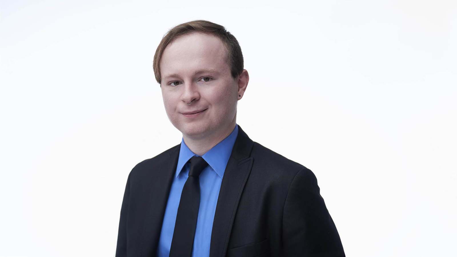
Photo: Core Visuals NYC
A speaker sends one photo and it gets cropped by four different people who never speak to each other. The conference wants a square. The podcast wants a face big enough to read at thumbnail size. The event program wants a tall portrait. Nobody asks first.
A speaker portrait works across formats when it is shot with deliberate empty space around the head, a background that survives tight and wide crops, and an expression readable at thumbnail scale. The technical requirement is a frame that can lose its edges without losing the person, since every downstream platform crops differently.
Table of Contents
You Are Not the One Cropping It
The defining constraint of a speaker portrait is that it will be cropped by strangers. A conference producer building a speaker grid, a podcast editor sizing a thumbnail, and a program designer laying out a page all crop to their own template, usually automatically, usually without looking at the original.
That makes framing the primary technical decision. A beautifully composed portrait where the head sits near the top of the frame is a good photograph and a bad speaker headshot, because a square crop will take the top off it. The photo has to be built to be cut, not just cropped after the fact.
The practical rule is deliberate margin: space above the head and on both sides that carries no information, so a crop can eat it without consequence. A camera's native frame is usually wider than a square, roughly 3:2. Shot at 6000 by 4000 pixels, a centered square crop takes 4000 by 4000 and throws away 2000 pixels of width. Shoot the person small in that frame and every one of those pixels is a format waiting to happen.
This is also why the portrait should be reviewed as a set of crops before anyone picks a favorite. Looking at the frame square, tall, and wide takes a minute and surfaces problems, a hand at the edge, a background detail that only distracts once the margins are gone, that a full-frame review never catches.
The Four Shapes to Ask For
Most of the back and forth around a speaker photo disappears once the request names the shape instead of just asking for "the headshot." Four requests cover almost everything a speaker will be asked for over a year of bookings:
- Square avatar. A 1:1 crop for a speaker grid, a program listing, or a profile photo. Needs the most headroom on the original, since a square is the tightest of the four shapes.
- Wide banner. A landscape crop, closer to the camera's native ratio, for a website hero or a slide. Needs open space to the side of the subject rather than above the head.
- Tall poster. A vertical crop, roughly 4:5, for event signage or a printed program cover. Needs headroom above and room below the shoulders, which is the shape most sittings shortchange.
- Print file. Not a different crop so much as a different resolution. A photo printed at 8 by 10 inches for a program needs about 2,400 by 3,000 pixels to hold up at standard print quality, well beyond what most web uploads carry.
Sending all four from one sitting, named plainly, is the difference between a speaker who answers every request in a minute and one who is still hunting for the original file the week of the event.
It Has to Read at the Size of a Postage Stamp
A podcast thumbnail on a phone is roughly the size of a fingernail. A speaker grid on a conference site is not much bigger. At that scale, subtle expressions disappear, low-contrast backgrounds merge with hair and shoulders, and anything clever in the composition is simply invisible.
What survives is contrast, a clear face, and an expression with some definite quality to it. That does not mean a wide grin; it means an expression that reads as something rather than as neutral, because neutral at thumbnail size reads as blank. This is the specific reason a good corporate headshot sometimes underperforms as a speaker photo.
A quick check is worth building into the review: look at the shortlist at about 100 pixels wide before choosing. Images that are indistinguishable from each other at that size are indistinguishable to most of the audience, and the one that still reads is the one to pick, even if a larger view suggests otherwise.
Grayscale is a useful second test. Some event programs and printed materials still run photos in black and white, and a portrait that depends on a color difference between subject and background can collapse once that difference disappears. Checking a desaturated version takes seconds and occasionally changes the pick.
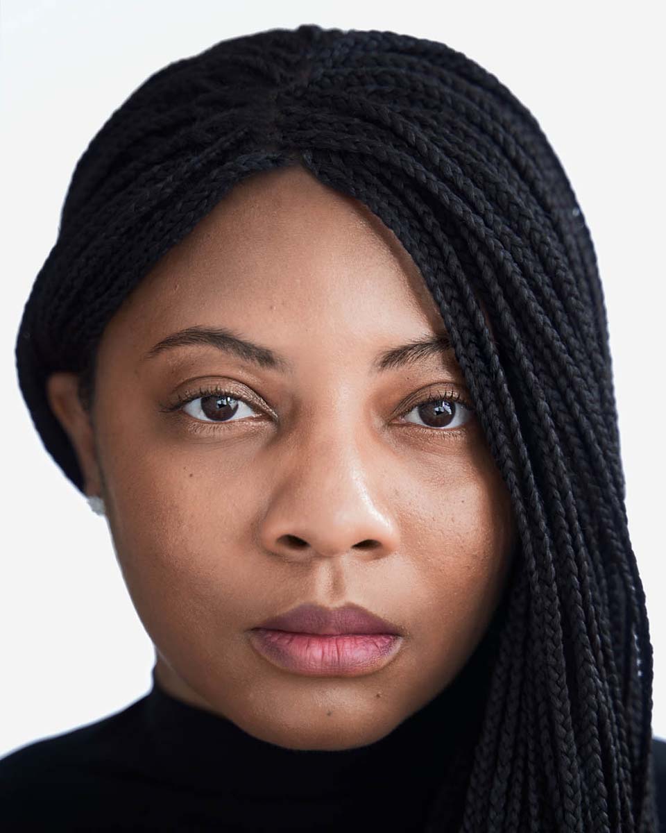
Photo: Core Visuals NYC
Backgrounds That Survive Both Crops
A background has to work tight and wide, which rules out a lot of environmental settings that look excellent at full frame. A busy office scene reads as texture in a square crop and as clutter at thumbnail size; a strongly patterned wall becomes noise the moment the frame tightens.
The reliable options are a clean neutral, a softly defocused environment with no identifiable objects, or a simple architectural tone. Any of them survive a hard crop because they carry no detail that has to be preserved. The choice between them is mostly about register, cleaner backgrounds read as more formal, defocused environments read warmer.
One background trap is worth naming: a background close in tone to hair or clothing merges at small sizes, and the head loses its outline. A small separation in brightness between subject and background is what keeps the portrait legible in a grid full of other speakers, and it costs nothing to plan for on the day.
If a speaker appears regularly on a particular series or panel format, it is worth asking what background their peers are shown against. Being the only environmental portrait in a grid of clean neutrals, or the reverse, is a small mismatch that draws attention for no useful reason.
Shoot Three Expressions, Not One
The same person needs a different register for a leadership panel than for a comedy podcast, and no single expression covers everything. A session should produce a small range: something warm and open, something more level and serious, and one in between that becomes the default.
Having the range solves a real problem later. When a speaker is booked for something with a different tone than usual, the alternative to a fitting expression is sending the wrong one or scheduling a shoot the week before the event. Three usable variants from one sitting removes that decision entirely, and it is well within what a standard session delivers. A team headshot session at Core Visuals hands back two to three final retouched options per person for exactly this reason.
The variants should share everything else, same background, same wardrobe, same lighting, so they read as a set rather than as photos from different years. That consistency is what makes it possible to swap them across platforms without anyone noticing a change in the person's public image.
A related choice is whether to shoot a version with visible glasses and one without, for anyone who wears them intermittently. Reflections and frame position change enough between the two that a later swap rarely convinces, and having both keeps the portrait accurate either way.
Wardrobe, Shoulders, and What Gets Cut Off
Because the crop is unpredictable, wardrobe decisions below the chest are largely wasted, and details near the neckline become disproportionately important. A collar that sits oddly, a bold pattern that starts at the shoulder, or a necklace that half-crops all become the most visible thing in a tight frame.
That argues for simple, solid tones near the face and for keeping anything visually loud further down where it may not survive the crop anyway. It also argues against strong logos on lapels and collars, which read as sponsorship in a context where a speaker usually wants to represent themselves.
Shoulder angle matters more here than in a standard corporate headshot, because a square crop tends to flatten a straight-on pose into something static. A slight turn of the body with the face returning toward the camera holds up better across formats, and it survives the tight crop a podcast thumbnail will apply.
Deliver It in the Shapes People Will Ask For
The last step is the one most often skipped: export the chosen frames in more than one aspect ratio before anyone asks. A square, a vertical, and a horizontal from the same original, cropped deliberately, means the speaker sends the right shape rather than sending one file and hoping.
Resolution matters at both ends. Event programs printed at full page need a genuinely high-resolution file, while some submission portals cap upload size and will reject that same image. Keeping a high-resolution master alongside a smaller web version prevents a scramble on the day a form refuses a file.
Naming the files so a non-designer can pick correctly finishes the job. Something as plain as square, vertical, and wide, with a note about which is the default, removes the most common cause of a mismatched speaker photo, which is rarely a bad portrait and almost always the wrong file sent under deadline.
Sending the set somewhere durable matters more than it sounds. A link that expires, or a file buried in an old email thread, means the next request gets answered with whatever is closest to hand, usually the outdated version the whole session was meant to replace.
Related Reading
Trying to get the whole team photographed without six separate sessions?
Tell us the group size and the format you need, and we'll come back with one fixed price that already has the volume discount worked in.
See Headshots & Brand Videos