Photo by Tima Miroshnichenko via Pexels.
Architecture and design firm headshots have a harder job than most corporate portraits, because the people judging them design things for a living. A flat, generic headshot doesn't read as neutral there the way it might at a law firm or an insurance office — it reads as a firm that didn't think about its own image, which is an odd thing to broadcast when thinking about how things look is the entire business.
The register that works for architecture and design firm headshots is creative but professional: considered without looking staged, close to how the firm's own work looks considered. The studio itself is usually the best background available, because it's full of material and evidence of craft nothing else can supply — and it's also the hardest room in the building to light well, for exactly the same reasons.
Table of Contents
- Why Design Firm Headshots Read Differently to Their Audience
- Using the Studio's Own Objects as Set Dressing
- Why That Same Studio Is the Hardest Room to Light
- Wardrobe for a Design-Literate Audience
- Principals, Associates, and the Same Frame
- Where a Studio-Culture Clip Belongs Next to the Stills
- What a Studio-Culture Clip Should Actually Show
- Scheduling a Headshot Day in a Working Studio
Why Design Firm Headshots Read Differently to Their Audience
Architecture and design firm headshots get judged by an audience that designs things for a living — clients, collaborators, and other designers notice framing, light, and composition the way most audiences never do. That pushes the bar past "professional and approachable." The portrait has to look considered, the way the firm's own work looks considered, without reading as staged.
A generic corporate headshot — flat light, plain backdrop paper, a smile aimed at a lens — reads as competent almost anywhere else. At a design firm, it reads as a firm that didn't think about its own image, an odd thing to broadcast when the entire business is thinking about how things look. The portrait becomes evidence, fairly or not, of how much attention the firm pays to its own presentation.
The fix isn't more polish. It's closer attention to the same variables the firm already obsesses over in its own work: negative space, material, proportion, where the eye lands first. A headshot built with that eye reads as consistent with the work on the walls, not as a separate marketing exercise bolted onto it after the fact.
Using the Studio's Own Objects as Set Dressing
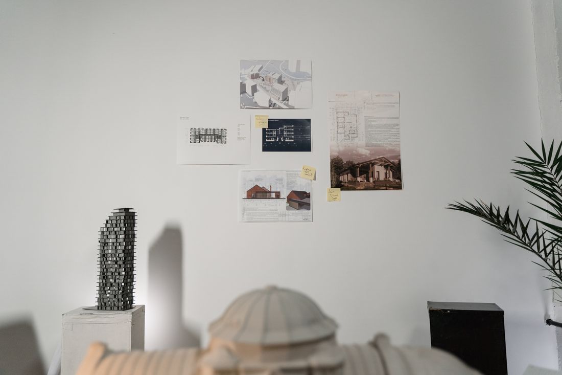
The strongest backgrounds for a design firm headshot are usually already sitting in the studio — a material board, a physical model, a stack of drawings, a shelf of finish samples. These objects do double duty: they fill the frame with texture that belongs to this firm specifically, and they signal craft without anyone having to explain what the firm does.
That's different from most corporate headshot advice, which pushes everyone toward a neutral backdrop precisely because most offices have nothing worth showing. A design studio is the exception. Desk clutter that would look messy behind a lawyer or an accountant reads as evidence of process behind an architect — sketches, trace paper, a half-built model are the visible residue of the actual work, not a distraction from it.
The judgment call is how much of it to include. A model in soft focus behind a shoulder adds context. A model in sharp focus competing with the subject's face turns the portrait into a still life with a person standing in front of it. We treat the object as seasoning, never the main course of the frame.
Why That Same Studio Is the Hardest Room to Light
The room that makes the best background for a design firm headshot is usually the hardest one to light well, because it's full of exactly the surfaces that fight even, flattering light: white models, glossy material samples, glass partitions, and mixed daylight and task lamps all running at different color temperatures at once.
A plain office wall gives a photographer one variable to manage. A working design studio hands over several at the same time — north-facing windows throwing cool light from one side, warm desk lamps from another, a glossy rendering pinned to a board that bounces a hot spot straight into the lens if the angle is wrong. None of that is a flaw in the room; it's just what a working studio actually looks like, and it has to be worked with rather than swapped out for a backdrop.
In practice, that means shaping light to sit on top of what's already there instead of overpowering it — enough fill to control the shadows a mixed-light room throws, without flattening the room into the same blank backdrop that using the studio as a background was meant to avoid in the first place.
Wardrobe for a Design-Literate Audience
Wardrobe for a design firm headshot should skew considered and quiet rather than corporate-formal — solid colors, clean lines, minimal pattern — because a design-literate audience reads a busy tie or a loud print as a choice, the same way they'd read a busy facade as a choice, and it competes with the portrait instead of supporting it.
This isn't the same advice a law firm or a bank gets. Suits and traditional business formality can read as slightly off in a design context, like the wardrobe belongs to a different industry than the work on the walls behind it. Most design professionals already dress with some intention day to day — that's worth photographing as it is, rather than overriding it with a generic corporate headshot wardrobe memo nobody in the room asked for.
One note still applies across the board: avoid anything that fights the camera technically — fine houndstooth, busy graphic prints, anything reflective enough to pick up studio lights as a second light source. Past that, the safest wardrobe guidance for this audience is closer to "wear what you'd wear to present to a client" than "wear what you'd wear to a deposition."
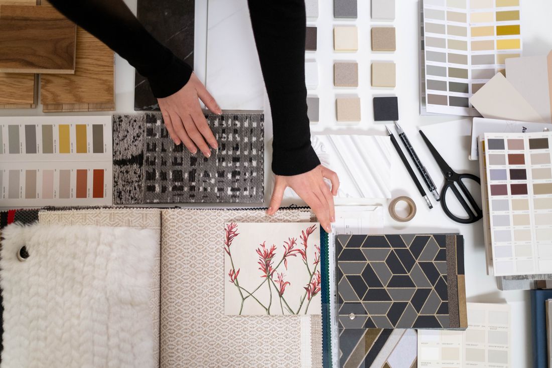
Photo by cottonbro studio via Pexels.
Principals, Associates, and the Same Frame
A design firm's headshot library usually spans principals who set the tone for how clients see the firm and associates who need to look like they belong to the same firm, not a junior version of it. The framing, crop, and lighting setup should stay identical across seniority — only wardrobe and expression have any real room to shift.
The mistake we see most often in practice is a founder's portrait shot with more care — better light, a tighter crop, a more considered background — while the rest of the team gets a faster, flatter pass on a different day. The intent is usually just time pressure, but the result reads as a hierarchy the firm never meant to put on its own website.
The way around it isn't shooting everyone identically regardless of role. It's locking the technical setup — light, distance, background treatment — before day one, so a principal's portrait and a new associate's portrait, whenever each actually gets taken, sit in the same visual family instead of quietly announcing who mattered more on shoot day.
Where a Studio-Culture Clip Belongs Next to the Stills
A short studio-culture video earns its place next to headshots when it does something stills structurally can't: show the studio in motion — hands moving over a model, a team gathered around a pinned-up board, the actual rhythm of how the firm works — instead of another static room shot dressed up as content.
The stills carry the identification job: this is who works here, and what they look like when a client meets them. The video carries a different job entirely — this is what it's like inside the process, the part a portrait can't show no matter how good the background is. Put them side by side and each one covers what the other structurally can't reach on its own.
This isn't a video for every headshot day. It earns its place on a careers page, an about page, or a pitch deck opener, where the audience is deciding whether they want to work with — or work at — this specific studio. A generic headshot session doesn't need a companion video bolted on just because the crew happens to already be there.
What a Studio-Culture Clip Should Actually Show
The clip that actually works shows specific, ordinary studio work — pinning up a drawing, handling a material sample, a real conversation over a model — rather than the generic "team laughing at a laptop" footage that reads as stock no matter which studio it was shot in.
Design work has an advantage most industries don't: the process itself is visually interesting without staging anything. A hand moving trace paper over a plan, a model getting adjusted under a light, a pin-up review with people actually pointing at something specific — none of that needs a director's note to look like real work, because it is real work, just filmed instead of described afterward.
The failure mode is over-directing it into the same corporate-culture cliché this format is trying to avoid in the first place — posed walk-and-talks, laughter cued for the camera, b-roll of typing that could be any office anywhere. The camera's job here is closer to documentation than production: get close to what the studio already does, and get out of the way of it.
Scheduling a Headshot Day in a Working Studio
A design studio headshot day works best scheduled around the studio's actual rhythm rather than treated as an event that takes over the space — a corner cleared for a short block per person, not desks pushed aside for a full production, because the studio still has deadlines running underneath the shoot day.
This matters more here than in most offices, because part of what makes the background work is that it looks like a studio actually in use, not one staged to look that way. A studio cleared out and rearranged for photos stops looking like the real place the moment it's tidied for the camera — the same authenticity that makes the background worth using in the first place gets undone by over-preparing it.
In practice, that means working in short blocks around whatever the team already has going, keeping the setup light enough to move between a desk, a model shelf, and a pin-up wall without a long reset each time, and treating the studio-culture clip, if there is one, as something captured in the gaps rather than its own separate production day.
Frequently Asked Questions
What should an architecture or design firm consider before scheduling headshots?
Design firm headshots get judged by a design-literate audience, so the biggest decision isn't the photographer — it's whether portraits should be shot against the studio itself or a neutral backdrop, and how much of the studio's own materials, models, and drawings to include in frame. Plan wardrobe toward quiet and considered rather than corporate-formal, and schedule around the studio's actual workday instead of clearing it out for a production.
Is a plain white background wrong for a design firm?
Not wrong, but it skips an advantage design firms specifically have: a studio full of material samples, models, and drawings that read as evidence of craft rather than clutter. White backdrops age well and stay consistent as a team grows. A studio background communicates more about the firm itself, at the cost of being harder to light evenly and harder to keep consistent as the space changes.
What should people wear for design firm headshots?
Solid colors and clean lines generally read best, since busy patterns and traditional business formality can look slightly out of place against design-forward work. Most design professionals already dress with some intention day to day, and that instinct is usually worth photographing as-is rather than overriding it with generic corporate headshot wardrobe advice. The one hard rule: avoid fine patterns or reflective fabric that fights studio lighting technically.
Do we need a studio-culture video in addition to headshots?
Not always. A short studio-culture clip earns its place when there's a specific spot for it — a careers page, an about page, or a pitch deck opener — where showing the studio in motion adds something static portraits can't. It isn't a default add-on for every headshot day. If there's no place the clip will actually run, the studio's time is better spent getting the stills right.
How do we keep headshots consistent across principals and associates?
Lock the technical setup — lighting, distance, background treatment, crop — before anyone is photographed, and keep it identical across every seniority level. The most common mistake is giving a founder's portrait more care than the rest of the team gets on a faster pass, which quietly puts a hierarchy on the website nobody intended. Wardrobe and expression can vary by person; the framing and light shouldn't.
Related Reading
Planning headshots for a finance or wealth management team?
Tell us your team size and the tone you're going for, and we'll build a session that fits the credibility bar this industry actually needs.
See Headshots & Brand Videos